|
In this game we had to trace various shapes using the pen tool. We had to click on where a point was to place it. If we wanted a curve in it, we would click and drag based on how we wanted the curve to look. If we wanted a point after a curve, you could press alt and see where you next point would bend to. This game was really challenging as if you made a mistake you would have to go and redo the point all over again. Overall, I really learned a lot about the pen tool with this game. 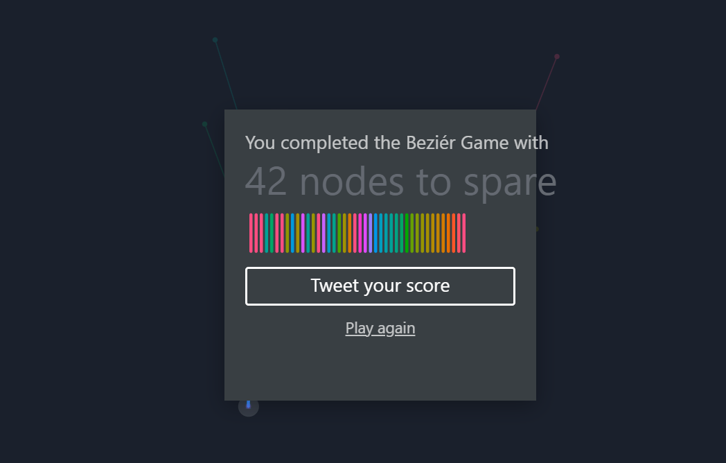
0 Comments
In this assignment we learned how to make badge icons using adobe illustrator. I increased my knowledge in making simple shapes, as I had challenges with the fishing rod and bucket. This was overall very useful for what Adobe Illustrator is used for. The usage of several tools to make complex shapes really challenged me and made me better at adobe illustrator.. I really like manipulating lines to make certain shapes for the fishing pole. Overall, this assignment was really enjoyable.
In this project we had to study a typeface and choose a font in that typeface. I chose Segoe UI Historic. We had to find the date of creation, traditional name, type of font, and all the characters. For this, I took advantage of the character select tool to make the files, and the direct select to fix them. We took advantage of the text tool to show and use our font. 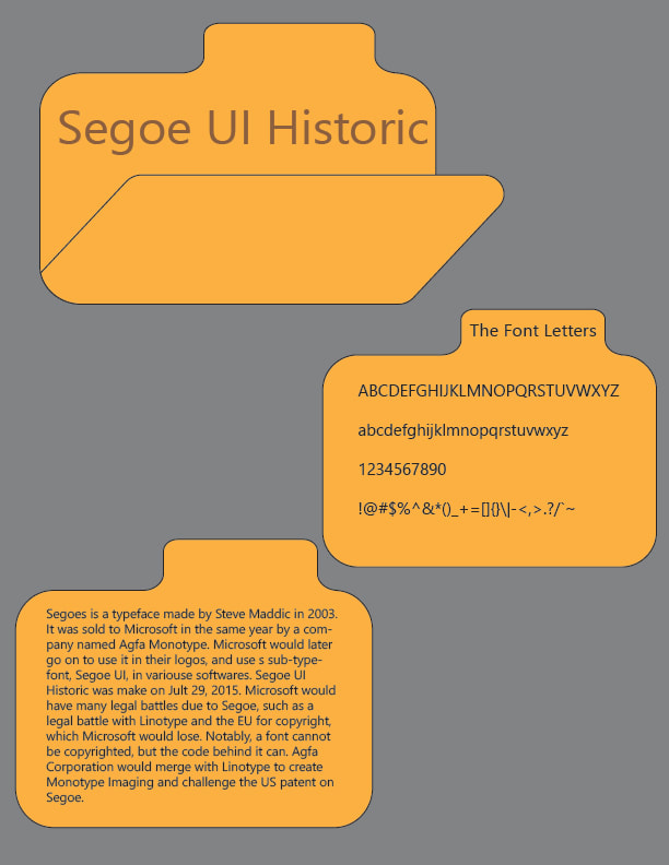 For this assignment we had to make a slice of pizza. We used Adobe Illustrator for the first time and need to learn the basics. We used the shape creation tool to make our shapes. We learned to select shapes and to press alt + shape selection tool to cut off bits that either overlapped.We had to add 3 pre-determined toppings and 1 of our own. I chose to use mushrooms for mine. For the mushroom I made a circle, put a small bar for the stem and a large bar to limit where the cap is. I then cut out the bottom part of the circle and the top bar. 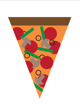 For this project we had to unwrap a model and texture it ourselves. We could adjust the seems to make areas of the tank we want separate in the template. When we were happy we saved it as a jpeg and put it on photoshop. We then made 2 copies and set one as the background. We then edited the second layer however we wanted the tank to look. I tried to make mine look like a realistic tank. I learned how to text in modeling software and use modeling software to their fullest extent and how to do all basic features. This shows how thy were intended to be used and how to make a career out of it. For this project we had to make a simple box with textures on each side. The challenge with this project was aligning each side correctly. The tape had to be lined up and not have any gaps between the edges. The top was a bit tricky because you had to rotate it 270 degrees. The tear on the top was a confusing part as it does not line up perfectly with any side, but it looks the best this way. I had to use bitmaps to assign the texture to an object, then Standards to give the file. In this project we learned how to add texture to objects and primitives. We made a few different objects using simple colors to model them, or an image as a texture. This lets the scene to have more creativity and more feeling in it. This is one of the more difficult side to modeling and one of the most useful. If you want to make an object have a different texture to it, you add a standard to the diffuse color, then create a bitmap, which you can then open your texture, and attach to the standard. You can make your object have a little more depth if you take it into photoshop and make it black and white, too. The composite images show different compositional techniques. 1. The rock forms a golden spiral. This is a bit scuffed, but I swear I'm sane. 2. The windows make 3 columns (odd number). An odd number of subjects will draw the human eye. 3. The window frame is in thirds. The window frame is in an are where a subject should be. 4. The chandelier is a golden spiral. This is easy to see as it forms the spiral itself. 5. the railing is in thirds making it an odd number. 6. The lamp forms a goldens spiral, while being overgrown. 7. The tree shows space and smaller, less eye-drawing subjects. 8. The three trees are an odd number and draw the human eye. 9. the lights are an odd number, drawing the human eye. 10. the poster shows space and nothing else to focus on. 11. the poster shows space, with nothing being able to be considered a subject. 12. the rows make thirds with thirds as the columns in between the window. I have completed my photoshop unit and gotten a ton of skills. I leaned how to cut out images and fine tune the cutout. I learned how to use layers and how to change color on images. I learned how to import more images into a scene and how to make shadows. I learned how color works in photoshop and how to use it. Overall, I learned a lot from this quarter.
For this project I had to make one image by combining 4 different images. I had to cut the subject out and place it in the road. I had a bit of a struggle finding good images, but I decided I decided on a few. I used the polygonal lasso tool to cut out the subject, the free transform to resize it. I blurred put the reflection on the cop car sot it fits in the environment. I then took advantage of the burn tool to make shadows on the background layer. This project really helped me with putting multiple images together into one. |
AuthorDisclaimer Statement contains the following statement: The views and opinions expressed in this blog are solely those of the author and do not represent those of Chapel Hill HS or Chapel Hill-Carrboro City Schools. CategoriesArchives
May 2024
|
||
 RSS Feed
